
MFit: University of Michigan student centric fitness app
While studying at the University, maintaining a healthy lifestyle can be challenging for students juggling academics, social commitments, and busy schedules. Despite access to campus gyms and wellness programs, many struggle due to time constraints, lack of motivation, or limited awareness. This case study introduces Mfit, a mobile app designed to improve access to wellness resources and motivate students through progress tracking. Rooted in user-centered design, Mfit offers affordable, personalized guidance to help students bridge the gap between intention and action, making healthy living achievable for all.

How might we…
How might we help students sustain a healthy lifestyle by improving access to physical wellness resources while keeping them motivated by tracking progress?.
Preliminary Research
We conducted semi-structured interviews with eight participants from diverse backgrounds, fitness routines, and academic commitments. Each interview lasted 15–20 minutes and was designed to explore topics such as fitness habits, resource awareness, and barriers to staying active. Our goal was to uncover the everyday challenges and motivations of students in pursuing their fitness goals. We sought to understand their behaviors, frustrations, and aspirations to ensure our app’s features would address real user pain points.
Key Findings:
Daily Schedules and Fitness Goals: Students highlighted the need for flexible fitness options to fit into their busy routines.
Motivations: Social accountability and stress relief emerged as key drivers for staying active.
Barriers to Resources: Many students were unaware of available campus resources or found them inaccessible due to cost or location.
Frustrations with Technology: Participants found existing fitness apps overly complicated or lacking personalization.
Expectations: Gamification and community-driven features were frequently mentioned as desired app elements.
Initial Ideation & Thematic Evolution
To create a tool addressing the challenges faced by students in maintaining a healthy lifestyle, we started with in-depth user research. This phase involved user interviews, a needs assessment, and the development of personas. By understanding our users, we laid the foundation for a design tailored to their specific needs and motivations.
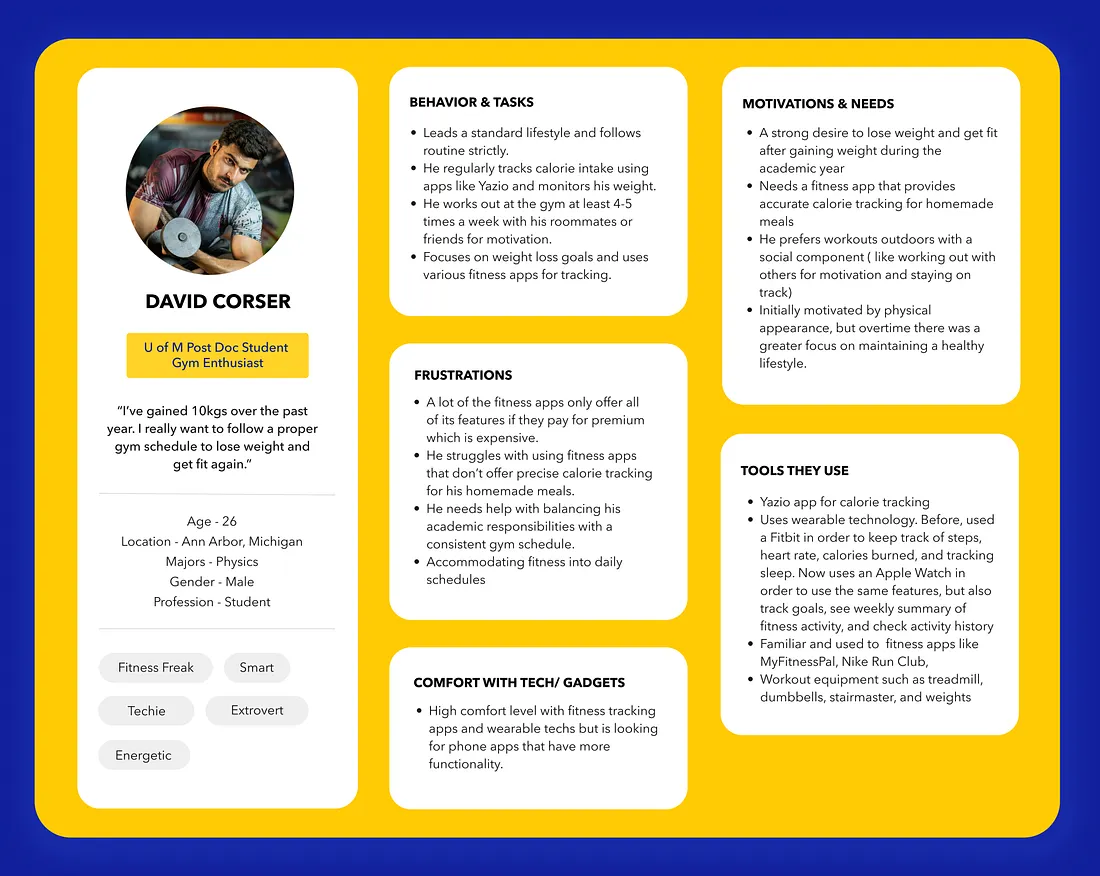
Meet the Personas: Our research revealed distinct user needs, which we represented through two personas: Kara Jane and David Corser. Kara, our primary persona, reflects the creative, flexible fitness routines that many students desire. Her needs and challenges were central to shaping the app’s core features. David, our secondary persona, reflects the highly structured, goal-driven approach of students who prioritize gym-based fitness routines.
From Personas to Features
The research findings informed several key design decisions:
Flexible Fitness Options: Participants’ need for short, adaptable routines led to the inclusion of daily challenges and quick workout suggestions.
Event Discovery: Limited awareness of fitness opportunities inspired the app’s event discovery tool, connecting users to local events and classes.
Gamification: User interest in motivation through rewards-shaped features like badges, leaderboards, and progress tracking.
Streamlined Navigation: Frustrations with app complexity drove our decision to create an intuitive, clutter-free interface.
Social Accountability: Feedback on the importance of community-inspired features like virtual workouts and group challenges.

Information Architecture
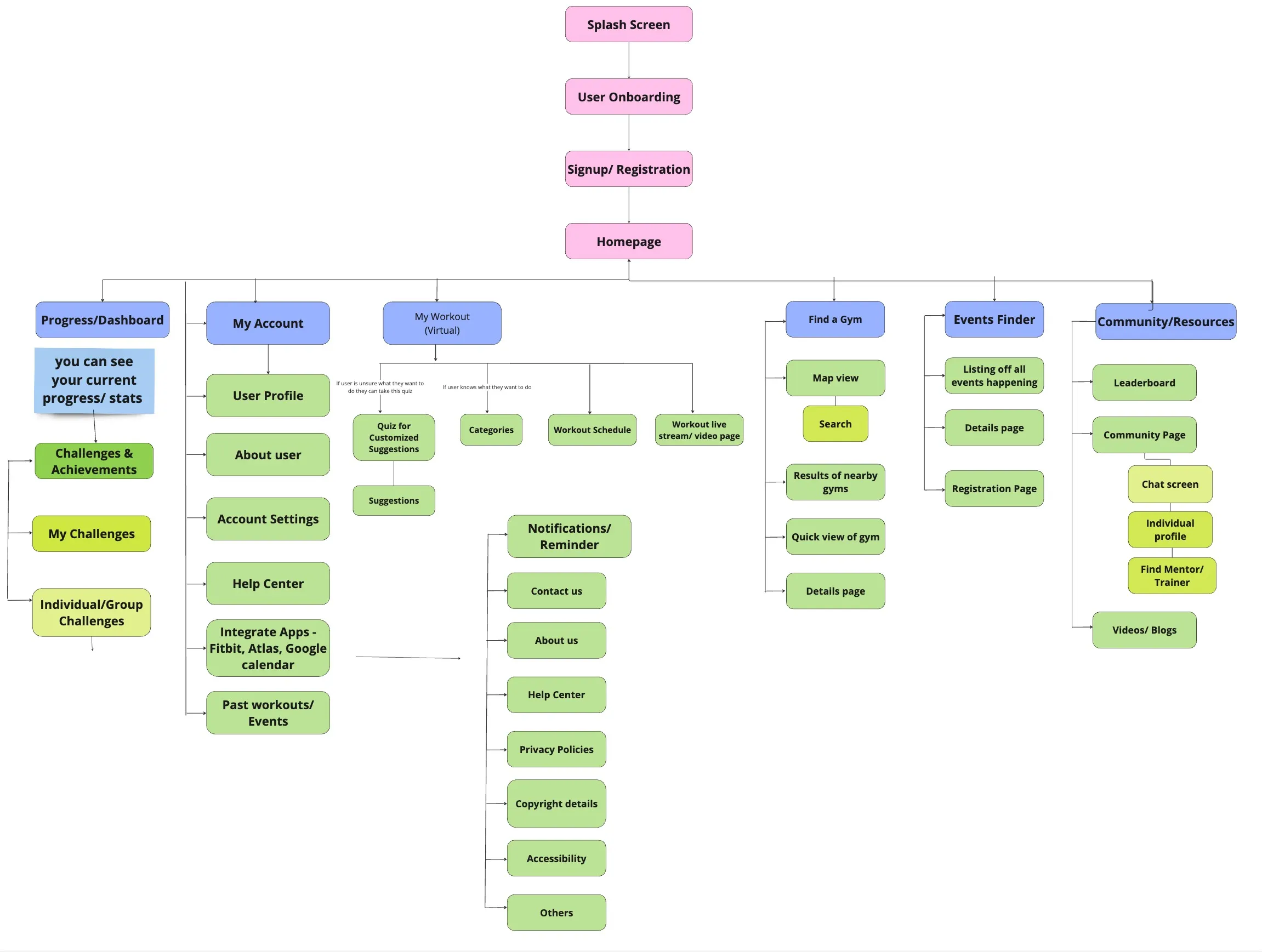
Site Map
Our site map shows a visual of the navigation between the various pages within MFit: starting from the splash screen to the homepage and onto the highlighted features of MFit.
Our highlighted features include the “My Workout” page, “Find a Gym” page, “Events Finder” page, and the “Community/Resources” page.
***Due to space constraints, the “Notifications/Reminder” heading was moved to the side. However, this section is a continuation of the blue “My Account” heading.***
User Flow Diagrams
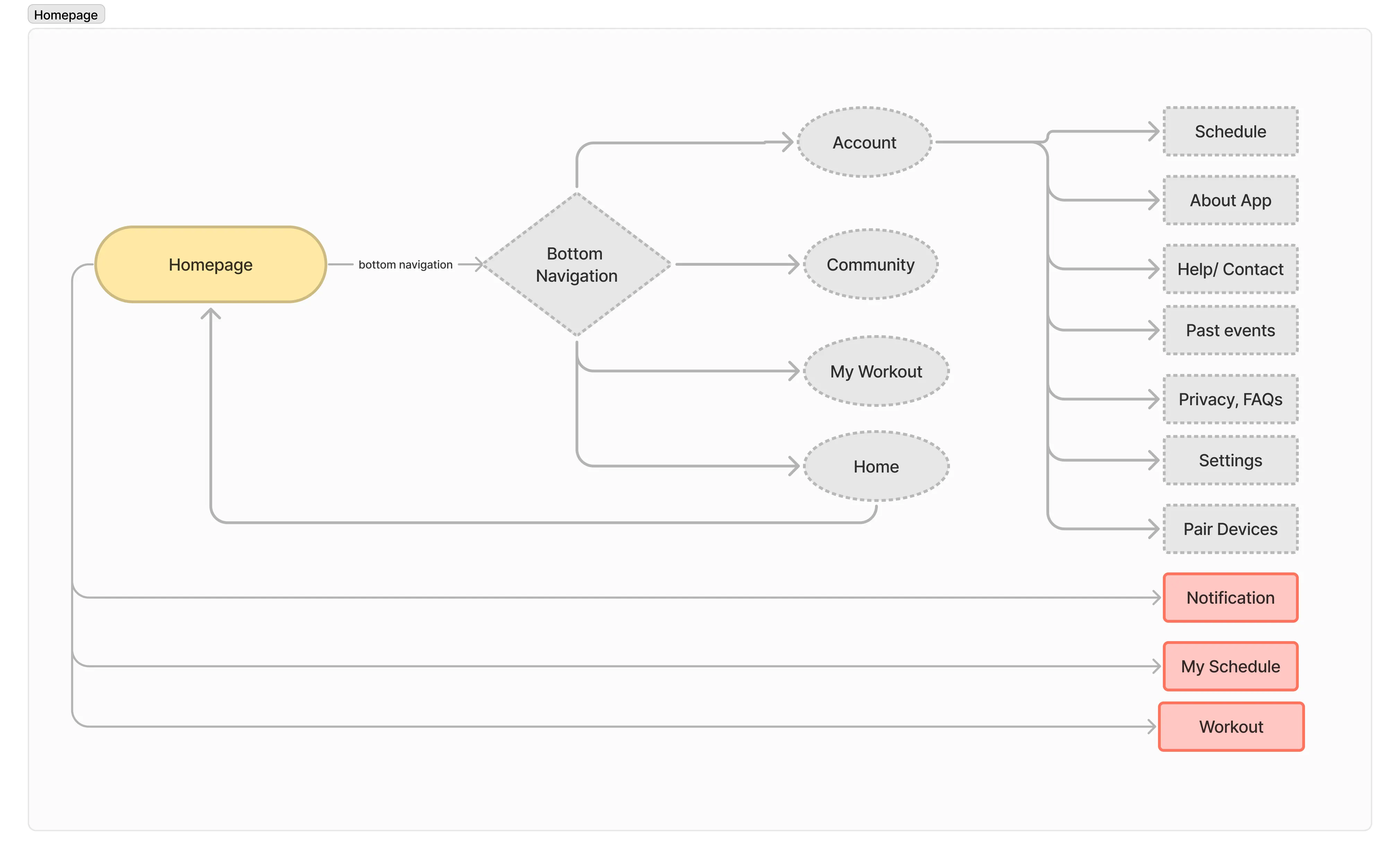
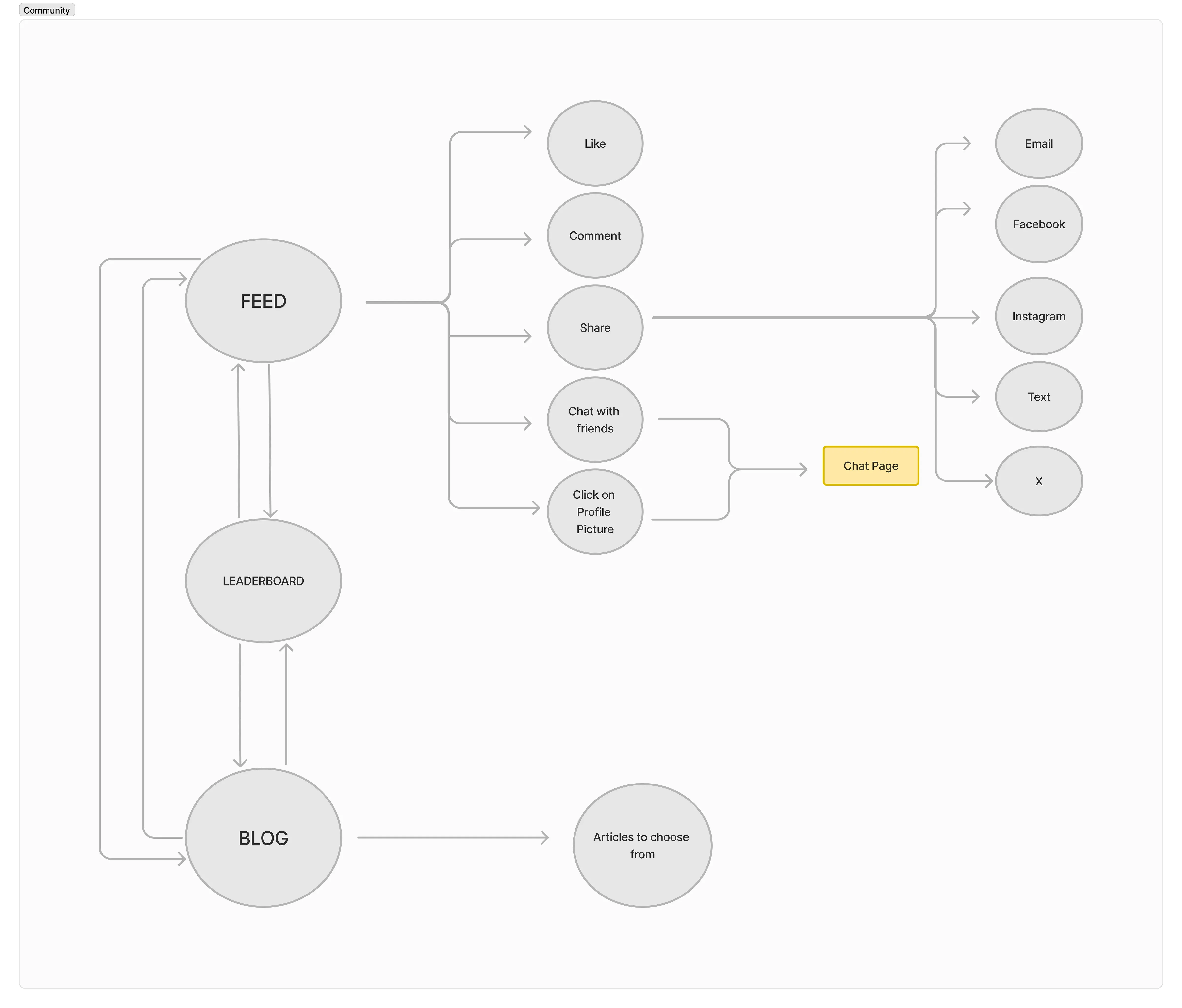
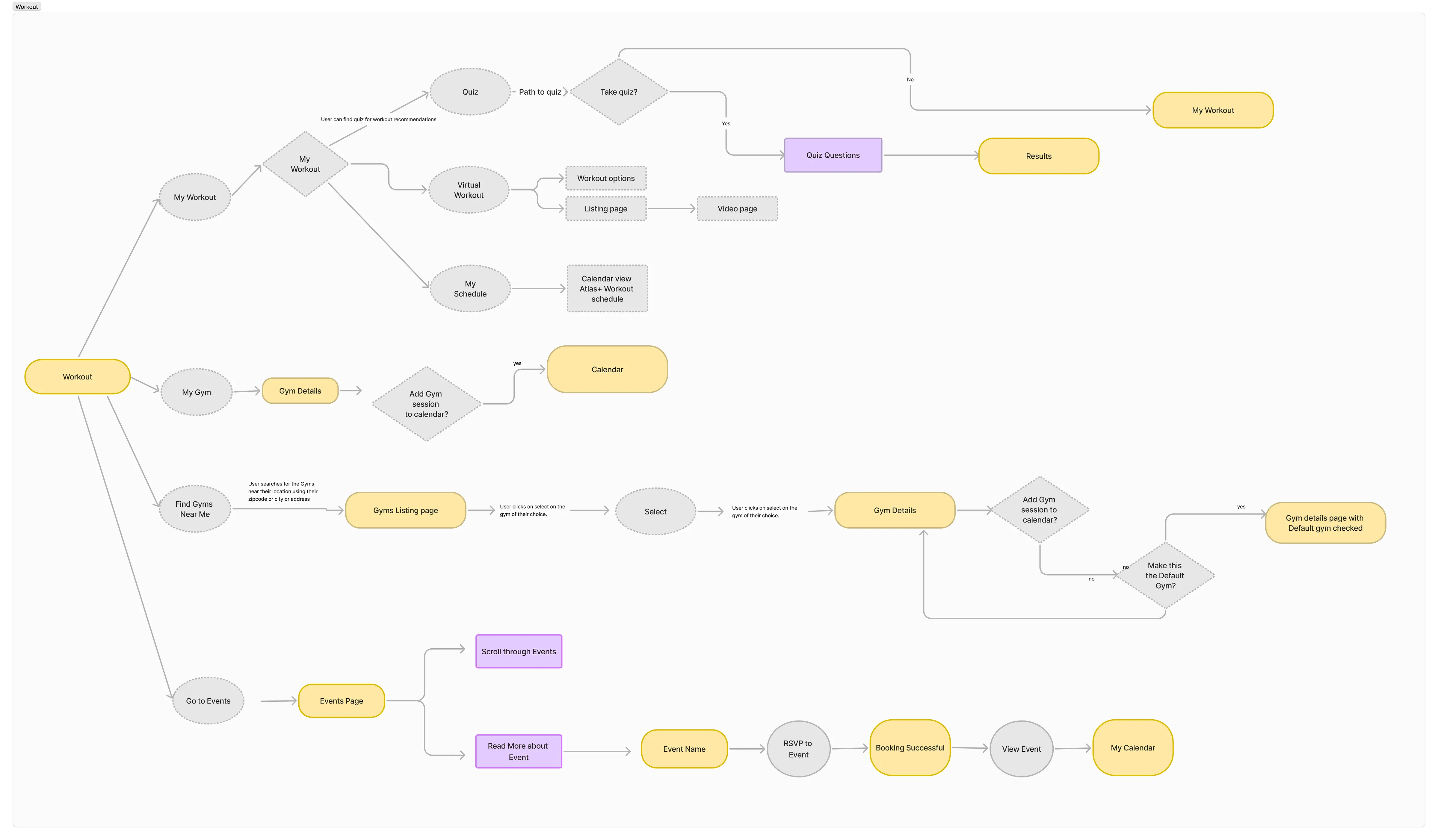
Our user flow diagrams show 4 different sections, Onboarding, Homepage, Community, and the Workout pages. These sections highlight specific navigation on MFit to make it easier for users to read, but all of these diagrams form the full User Flow Diagram for MFit.
Onboarding User Flow: The onboarding user flow shows the navigation from the splash screen to the onboarding page. Users are then allowed to choose between logging in or signing up, both of which eventually allow them to navigate to the homepage.

Homepage User Flow: The homepage allows for navigation to all the features offered within the app. The bottom navigation is also accessible through the homepage which allows users to navigate to specific sections within the app. This diagram shows the account page highlighted.
Community User Flow:The community page allows for navigation to 3 different pages, including the feed, the leaderboard, and the blog pages. The feed pages evolve into a chat page that allows users to communicate with their workout buddies.
Workout Page User Flow: The workout page highlights four different pathways, which also showcases several key features of the app, including the “Fitmatch quiz”, “virtual workout” pages, and the “go to events” pages.
The calendar is showcased under “My workout”, “My Gym”, and the “Go to Events” which allows users to add events to their calendar.
Low Fidelity Prototype
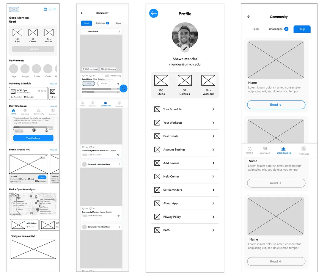
Following our user interviews and persona creation to understand the expectations and needs of our potential users, we delved into creating low-fidelity wireframes for the ideas we brainstormed together. We drew the initial wireframes by hand. We then converted these handmade wireframes into low-fidelity digital wireframes on Figma.

Usability Testing & Insights
Usability testing was crucial to ensure Mfit met the needs of students and provided a seamless user experience.
Objectives:
Identify weak points: Uncover the areas where users struggled to complete tasks.
Evaluate the flow and navigation: Check to see if the features as well as the layout were intuitive and easy to use.
Validate the features: Test the functionality and satisfaction of the key features: adding a fitness event to the calendar, a quiz that creates personalized recommendations, and joining a virtual workout session.
Recruiting Participants
Six UofM students were recruited — the target audience for Mfit. They were recruited through flyers posted on campus and the UofM Facebook groups. Participants included:
Students of varying fitness levels (beginner, intermediate, advanced) and goals.
Students from a diverse range of majors, not including UX/UI as prior knowledge may skew the results.
Design Feedback & Iterations
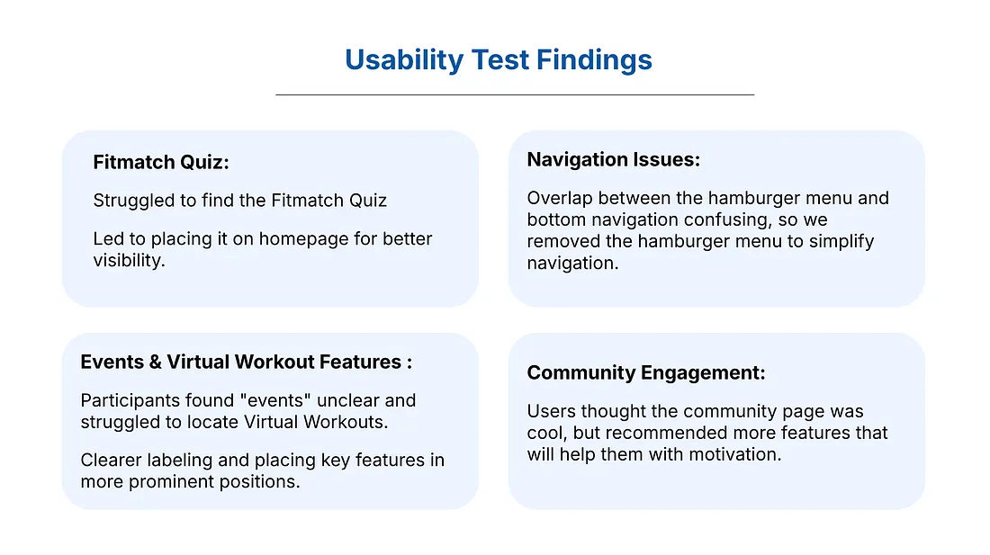
1, Adding the quiz feature on the homepage
We added a quiz feature on the homepage, so that users were able to easily access it and navigate to that page. Putting the quiz feature on the homepage utilizes Nielsen’s heuristic Flexibility and Efficiency of use because it speeds up the interaction and there are fewer steps for the user to navigate to the quiz page.

2, Removing the hamburger menu
Removing the hamburger menu utilizes Nielsen’s heuristic of Error Prevention by preventing the error from ever occurring. This would make sure that users do not get confused by believing the hamburger menu contains the various features offered within the app.
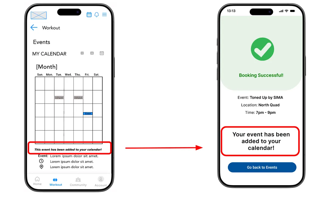
Clear Labeling under Add an Event page
We used a larger font size and bold print for the “Your event has been added to your calendar!” label. Using knowledge from Fitt’s law, making the text larger would allow for less time for users to visually move to the target. This would create more efficient navigation for users.
Adding more features to motivate users
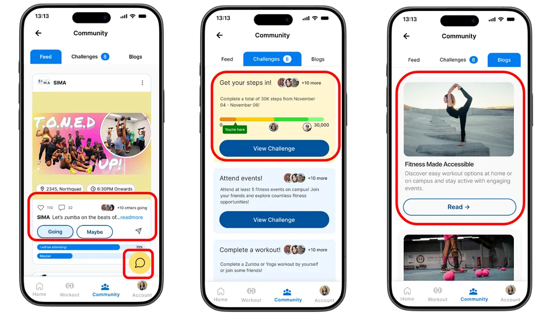
Using Hick’s law, we included just enough features to allow users to become more motivated to work out. However, we kept in mind to not overwhelm users with too many options. This led to us creating a feed page offering users the option to interact with posts, a challenge page that allows users to join and gain points through challenges, and a blog page that features articles for users to read.
Visual Design
The visual design was guided by four principles:
Consistency: By following Gestalt’s principle of similarity which is when elements share similar characteristics, they are perceived as grouped, this ensures a cohesive design.
Clarity: Prioritize a clean layout and a readable font.
3. UofM Brand: Align with the UofM brand colors, to maintain the visual identity and build brand recognition.
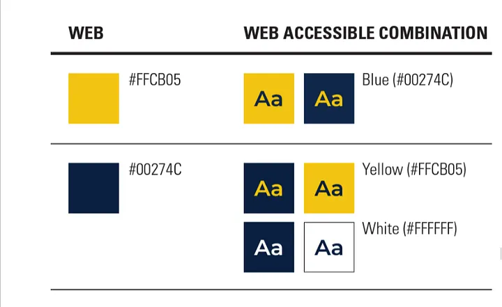
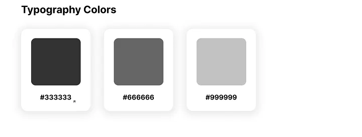
4. Accessibility: Color contrast readability.
Color Palette:
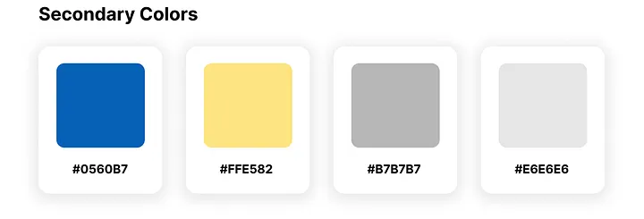
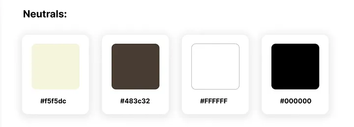
We ensured that the colors matched the primary brand colors of UofM, while also using various shades and tints of those colors for the secondary colors.

Typography:
Primary Typography: Inter, a sans serif typography with open counters, enhancing legibility, extended tails, and emphasized dot size on the ‘i’ and the ‘j.’
The varying sizes demonstrate the visual hierarchy to differentiate between the headings, subheadings, and body text.

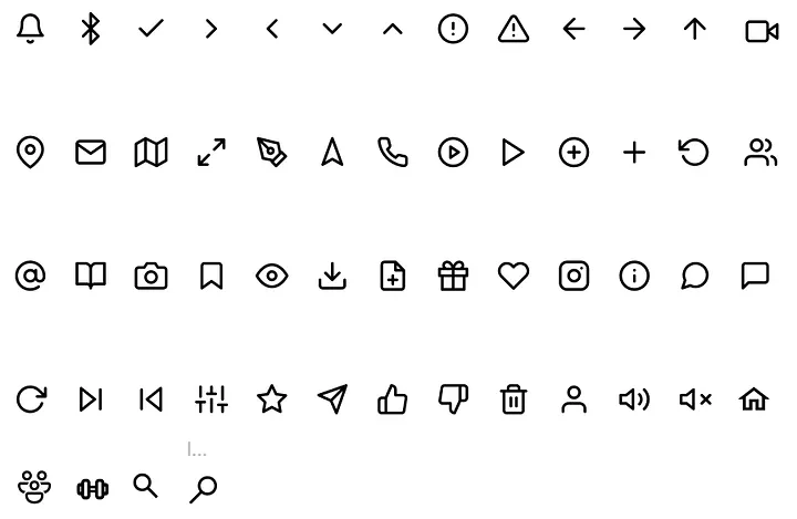
Iconography:
Ensured same line thickness, color, depth/flatness, and same style.
Avoided using complex icons.
Ensured that the icons could be intuitively understood/easily learned.
Final Concept
The final app is a centralized, accessible platform that allows students at the University of Michigan to have better access to fitness classes and gyms, while taking into consideration their needs and busy schedules.It is structured around three core pillars designed to ensure accessibility to information, efficient information, and effortless engagement:
Workout Features: Users have access to nearby workout classes and events, where they can instantly RSVP to secure a spot. They can also find gyms which includes information on the kind of equipment they have and reviews.
At home consideration: Students are busy, meaning they do not always have a sufficient amount of time to meet their fitness needs. The app provides at home alternative workouts which they can customize according to their needs. For those that are just getting started, they can take a quiz to receive personalized recommendations.
Community Engagement: Users have the opportunity to befriend other users on the app, go head-to-head in weekly challenges, and receive badges based on their completions. In this way, users can ensure they stay motivated and active.


Reflection
Iteration is Key: Usability testing showed us how small changes — like removing the hamburger menu — could significantly improve navigation. These adjustments made the app feel more intuitive for users.
The Value of Collaboration: Each of us brought different ideas and perspectives, which made the final solution stronger. Collaborating throughout the process taught us how to combine our strengths effectively.
User Research Guides Design: Insights from interviews, like the need for more accessible fitness options and motivation tools, helped us focus on features like event discovery and tools that directly addressed user needs.
Get Athos Pro